If you want to add a press slider to your Shopify store, you’re in the right place. A press slider displays your brand’s media coverage, logos, or featured publications in an attractive and interactive way. This can boost your store’s credibility and engagement.
In this guide, we will show you the easiest ways to set up a press slider and make your Shopify store look more professional.
Ways to Add Shopify USP Slider
There are typically two ways to add this section to your store.
- Custom code – This method gives you total control over the design. It’s a great option if you have specific design requirements and the technical expertise to implement them, but it does consume a lot of time.
- Shopify app – This is the easiest way to add this feature. You get a pre-designed template and a user-friendly editor, allowing you to quickly add and edit without any coding. A low effort task.
Custom Code to Add Press Slider in Shopify
Below are the steps to add a press slider section using Liquid code.
Step 1: Create a New Section
From your Shopify admin panel, navigate to Online store > Themes > …(three dots) > Edit code.
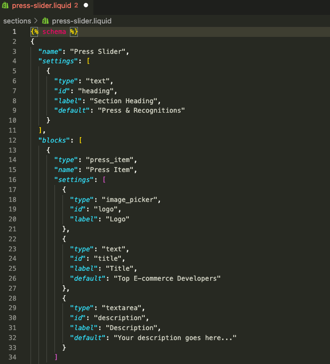
In the Sections folder, add a new section and save it as press-slider.liquid.
Step 2: Add the Press Slider Code
Then paste the following code into the newly created section and save it.
{% schema %}
{
  "name": "Press Slider",
  "settings": [
    {
      "type": "text",
      "id": "heading",
      "label": "Section Heading",
      "default": "Press & Recognitions"
    }
  ],
  "blocks": [
    {
      "type": "press_item",
      "name": "Press Item",
      "settings": [
        {
          "type": "image_picker",
          "id": "logo",
          "label": "Logo"
        },
        {
          "type": "text",
          "id": "title",
          "label": "Title",
          "default": "Top E-commerce Developers"
        },
        {
          "type": "textarea",
          "id": "description",
          "label": "Description",
          "default": "Your description goes here..."
        }
      ]
    }
  ],
  "presets": [
    {
      "name": "Press Slider",
      "category": "Custom"
    }
  ]
}
{% endschema %}

<section class="press-slider">
  <div class="container mx-auto px-4">
    {% if section.settings.heading != blank %}
      <h2 class="text-center text-2xl font-bold mb-8">{{ section.settings.heading }}</h2>
    {% endif %}
    <div class="swiper pressSwiper">
      <div class="swiper-wrapper">
        {% for block in section.blocks %}
          <div class="swiper-slide">
            <div class="press-card p-6 bg-white rounded-2xl shadow-md text-center">
              {% if block.settings.logo %}
                <img src="{{ block.settings.logo | img_url: '1000x' }}" alt="{{ block.settings.title }}" class="mx-auto mb-4 h-16 object-contain">
              {% endif %}
              <h3 class="font-semibold text-lg mb-2">{{ block.settings.title }}</h3>
              <p class="text-gray-600 text-sm">{{ block.settings.description }}</p>
            </div>
          </div>
        {% endfor %}
      </div>
      <!-- Slider navigation -->
      <div class="swiper-button-next"></div>
      <div class="swiper-button-prev"></div>
    </div>
  </div>
</section>

{% stylesheet %}
.press-card {
  min-height: 250px;
}
.swiper-button-next, .swiper-button-prev {
  color: black;
}
{% endstylesheet %}

{% javascript %}
var swiper = new Swiper(".pressSwiper", {
  slidesPerView: 3,
  spaceBetween: 20,
  loop: true,
  navigation: {
    nextEl: ".swiper-button-next",
    prevEl: ".swiper-button-prev",
  },
  breakpoints: {
    1024: { slidesPerView: 3 },
    768: { slidesPerView: 2 },
    480: { slidesPerView: 1 }
  }
});
{% endjavascript %}
Step 3: Edit & Preview the Section
Now add this section to the page, head to Online store > Themes > Customize.
From the theme editor, click the Add section and select Press slider.
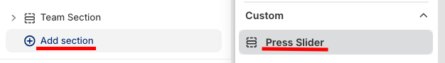
Then, from here, you make the basic changes.
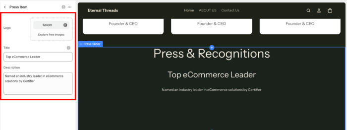
Once done making the changes, save them, and this is how it will look (simple and minimal layout).

Add Press Slider Section Using an App
Our app MIT Sections Pro gives you the full authority to customize the section however you want, plus it gives you multiple different styles of the sections, which you can choose from. The plus point is that you don’t need coding, and it can be added quickly.
The section you’ll get like this after using our app.

Let’s see the app config.
Step 1: Directly Add the Section
Install the MIT Sections Pro from the Shopify App Store, then from the app dashboard, click Browse sections and search for the press slider.
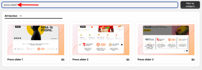
Here we will move forward with the Press slider 3. You can select the one that goes with your brand. Select the section and click Try for free to check the features and preview of the section with zero cost.
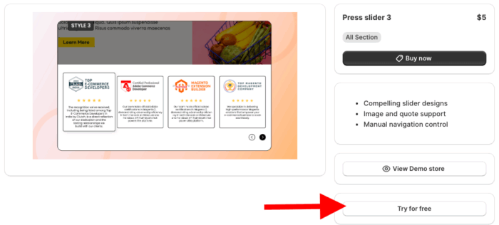
While on the free trial, you will be redirected to the MIT demo store. After buying the section, you can integrate it into your store’s theme.
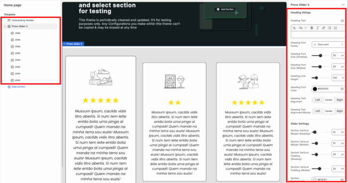
Step 2: Customize as You Like
Now, from the Shopify theme editor, click Press slider 3 to access the customization settings. Here, you get 20+ options to blend the section as you wish.
Step 3: Display in Your Store
After making the edits in the section, save them, and this is how it will look.

Why Use the MIT Sections Pro App?
Choosing MIT Sections Pro for your store means opting for an easier approach to integrating stunning sections effortlessly, rather than simply adding features.
Beyond just the press slider, our app provides a comprehensive suite of over 130 free and premium sections, including a Shopify number counter section, banners, testimonials, and FAQs, all designed to help you construct an exceptional Shopify store.
With our app:
- Access a wide selection of professionally-designed sections to fit any storefront need
- Start with free templates, or upgrade to premium options for advanced designs
- Easily add, configure, and replace sections at any time, with no technical skills needed
- Seamless compatibility with all Shopify themes, ensuring fast page speed and smooth integration
- Unlimited customization with no locked or restricted features
- Ability to add or swap sections as your store evolves, keeping your design fresh
- Free to install with clear and affordable pricing suitable for any business size
- Enjoy a free trial to test compatibility and features before making a commitment
Your all-in-one solution to create a professional Shopify store
Install App Now
