Adding a product image gallery in Shopify lets you showcase multiple product photos in one place.
In this guide, we’ll show you how to easily add and customize a Shopify product image gallery using two different methods.
Different Ways to Add an Image Gallery to Shopify
There are mainly two options to add an image gallery section in Shopify, which are as follows
- Use the Shopify theme editor – This method will require coding skills and is a time-consuming process. You have to create a new liquid file and add the code in it, and if any changes are required, you have to make changes in the code.
- Directly add an image gallery section – Using an app provides a significant advantage with diverse pre-built sections (free and paid), enhancing functionality beyond standard themes for richer content and more customization without extensive coding.
How to Add a Shopify Image Gallery via Code?
Here are the steps to create a product image gallery section using the custom code.
Step 1: Create a New Gallery Section in Shopify
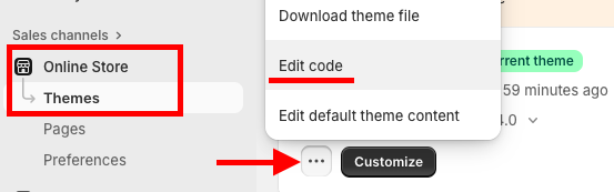
In your Shopify admin, navigate to Online Store > Themes > …(three dots) > Edit code.
In the Sections directory, click Add a new section and name it gallery-section.liquid.
Step 2: Add the Code to the Section
Paste this code in the newly created gallery-section.liquid file.
This code creates a basic gallery section with a title and a block for each image.
{{ 'section-gallery.css' | asset_url | stylesheet_tag }}

<div class="gallery-section">
  <div class="page-width">
    {% if section.settings.title != blank %}
      <h2 class="gallery-section__title">{{ section.settings.title | escape }}</h2>
    {% endif %}

    <div class="gallery-grid">
      {% for block in section.blocks %}
        <div class="gallery-grid__item">
          {% if block.settings.image != blank %}
            <div class="gallery-image-wrapper">
              <img
                src="{{ block.settings.image | img_url: '1024x' }}"
                alt="{{ block.settings.image.alt | escape }}"
                loading="lazy"
                class="gallery-image"
              >
            </div>
            {% if block.settings.caption != blank %}
              <p class="gallery-caption">{{ block.settings.caption | escape }}</p>
            {% endif %}
          {% else %}
            {{ 'image' | placeholder_svg_tag: 'placeholder-svg' }}
          {% endif %}
        </div>
      {% endfor %}
    </div>
  </div>
</div>

{% schema %}
{
  "name": "Gallery",
  "tag": "section",
  "class": "section-gallery",
  "settings": [
    {
      "type": "text",
      "id": "title",
      "label": "Heading",
      "default": "Image Gallery"
    }
  ],
  "blocks": [
    {
      "type": "image",
      "name": "Image",
      "settings": [
        {
          "type": "image_picker",
          "id": "image",
          "label": "Image"
        },
        {
          "type": "text",
          "id": "caption",
          "label": "Image caption"
        }
      ]
    }
  ],
  "presets": [
    {
      "name": "Image Gallery",
      "category": "Image",
      "blocks": [
        {
          "type": "image"
        },
        {
          "type": "image"
        },
        {
          "type": "image"
        }
      ]
    }
  ]
}
{% endschema %}
Also, add CSS for modern and enhanced styling.
To do so, in the Assets directory, create a file named section-gallery.css and paste the following code.
This CSS file will control the layout and appearance of your gallery.
.gallery-section {
  padding: 50px 0;
}

.gallery-section__title {
  text-align: center;
  margin-bottom: 30px;
}

.gallery-grid {
  display: grid;
  grid-template-columns: repeat(auto-fit, minmax(250px, 1fr));
  gap: 20px;
}

.gallery-grid__item {
  display: flex;
  flex-direction: column;
  align-items: center;
}

.gallery-image-wrapper {
  width: 100%;
  overflow: hidden;
  border-radius: 8px;
}

.gallery-image {
  width: 100%;
  height: auto;
  display: block;
}

.gallery-caption {
  margin-top: 10px;
  text-align: center;
  font-size: 14px;
  color: #555;
}

.placeholder-svg {
  width: 100%;
  height: 250px;
  background-color: #f0f0f0;
  border-radius: 8px;
}
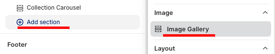
Step 3: Customize Using the Theme Editor
Head to the theme editor, Online store > Themes > Customize. Find and add the section we created.
Then, from here, add the image you want to display in the image gallery. To make sure your visuals look sharp and load fast, check out our Shopify Image Sizes Guide.
Save the changes. And this is how it’ll look, simple and minimal.

Steps to Add a Direct Shopify Image Gallery Section
Now, let’s try the image gallery section through a Shopify section app.
The best part is that the app gives you complete control to display your images without coding a single line. You can use the simple settings to make changes that fit your brand guidelines, which ultimately saves you a ton of time and effort.

For creating a section just like the above displayed, we will use the MIT Sections Pro app, (super simple and easy) gives you numerous options to choose from and letting you try it for free.
Step 1: Install App & Find Your Desired Section
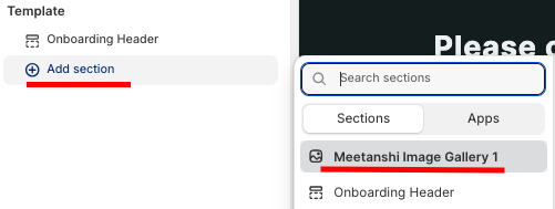
Install the MIT Sections Pro app from the Shopify App Store. From the app dashboard, click the Browse section and search for the image gallery section.
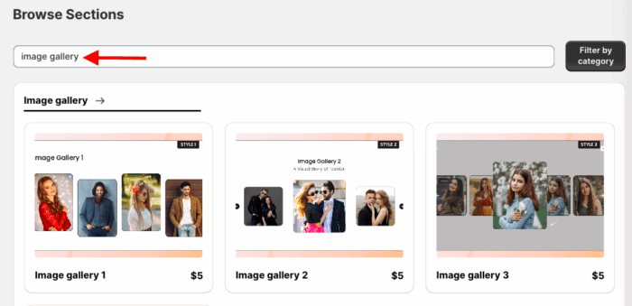
Here we’ll select the image gallery 1.
Step 2: Click on the “Try for Free” Button
Once you select the section, click Try for Free to check the compatibility before making the purchase.
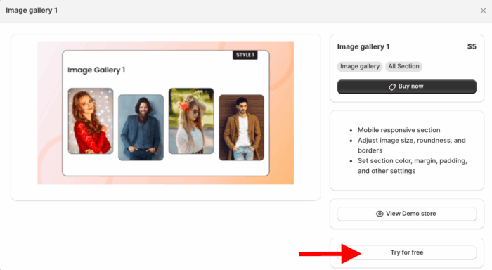
During the free trial, you’ll be redirected to the MIT demo store. Once you’ve purchased the section, you can then add it to your own store’s theme.
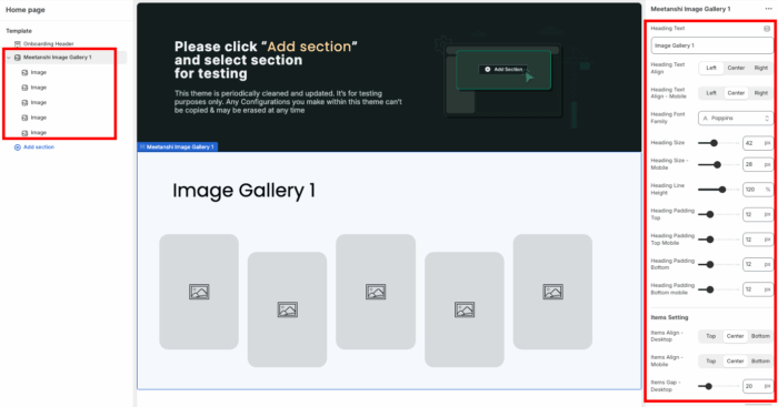
Step 3: Modify the Image Gallery Section
Now add the section into the theme, click the Add section, and select Meetanshi Image Gallery 1.
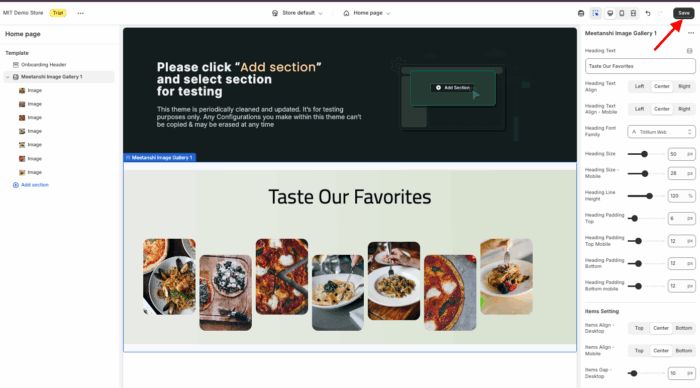
This section offers a bunch of options to customize and style it as per your brand’s aesthetic.
Save the changes.
MIT Sections Pro: A Code-free Way to Add Sections
MIT Sections Pro is the ticket to creating the store of your dreams. With it, you have the freedom to design everything just the way you like.
Apart from the image gallery sections, it has 130+ free and paid pre-built sections, and you can easily add newsletters, banners, testimonials, FAQs, and more without any technical headache.
- Get access to over 130 pre-designed sections, available in both free and paid options, making professional design accessible to all merchants
- The app is 100% free to install, and all free templates come with advanced customization features
- All sections are fully optimized for fast loading and are compatible with every Shopify theme
- Gain full customization control to perfectly match your store’s aesthetic and branding
- Easily add, edit, or replace sections as your business develops, ensuring your store grows with you
- Start for free and only pay for what you need, making it an affordable solution for businesses of any size
Your all-in-one solution to create a professional Shopify store
Install App Now
