Shopify doesn’t include a built-in before-and-after image slider, but adding one is simple.
This guide will show you the easiest ways to add a Shopify before and after slider to your store to highlight product impact and build customer trust.
Ways to Add a Before and After Slider in Shopify
There are probably three ways to add this:
- In-built themes – Some Shopify themes come with a built-in before-and-after slider section. This option is simple if your theme supports it, but it may offer basic functionality and limited customization.
- Via custom code – If there is no in-built option, you can manually add a before and after slider using Liquid, CSS, and JavaScript code into your theme. This method offers more control and customization but requires technical skills and more setup time.
- Using the Shopify app – Using a Shopify app is the most flexible and beginner-friendly approach. Apps provide ready-made before and after slider sections, advanced design options, and responsiveness, with no coding needed. This method works with any theme and often includes extensive customization features.
How to Add a Before and After Slider Using the Shopify App
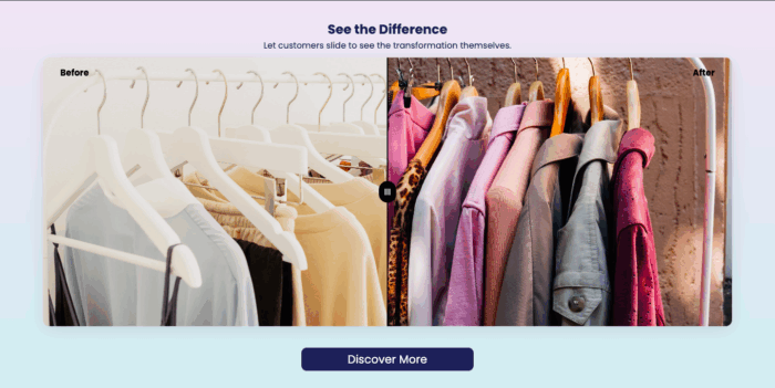
A good before/after Shopify slider should have a clean, minimal design with a bold dividing line or handle that users can easily drag left and right so the transformation looks sharp and engaging.
Like this:
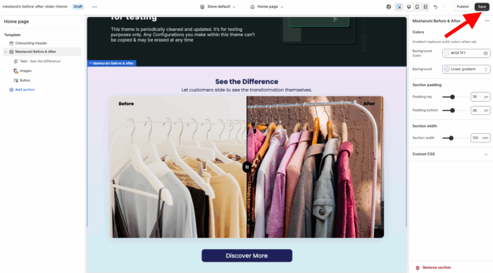
With the MIT Sections Pro Shopify app, you can customize settings for mobile and desktop, include a Shop Now button, and personalize each element. This offers more flexibility than code-based or alternative methods.
Here are the steps to configure the app.
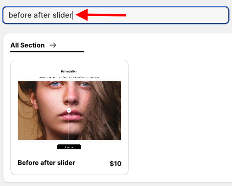
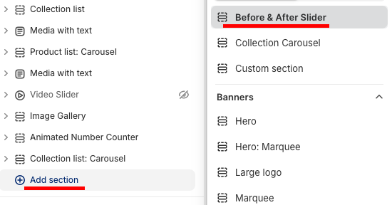
Step 1: Install and Select Your Desired Section
Install the MIT Sections Pro from the Shopify App store, and from the app dashboard, click Browse sections and search for the Before After slider.
Step 2: Click the “Try for Free” Button
Select the section and click the Try for Free button to get the no-cost trial of the section.
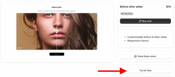
During the free trial, you will be directed to the MIT demo store. After purchasing the section, you can integrate it into your store’s theme.
Then, from the theme editor, select the Meetanshi Before & After section.
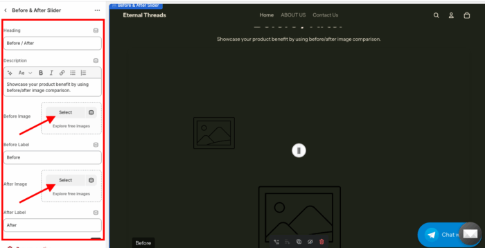
Step 3: Edit the Before/After Section
Then, from here, you can customize the slider as per your needs and make the section yours.
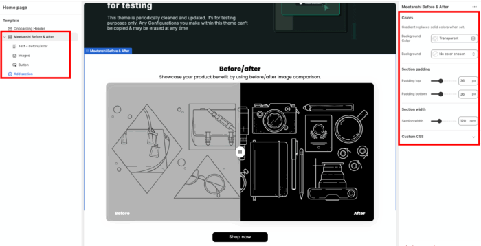
Once you are done with the changes, save them.
Steps to Add Before & After Shopify Slider (Via Custom Code)
These are the steps to create a before-and-after slider using the liquid code.
Step 1: Create the Liquid Section File
First, create the main section file. Head to your Shopify admin, go to Online Store > Themes > …(three dots) > Edit code.
Under the Sections directory, add a new section, and name the file before-after-slider.liquid.
Copy and paste the entire code below into the new file.
{{ 'before-after.css' | asset_url | stylesheet_tag }}
{{ 'before-after.js' | asset_url | script_tag }}

<div class="before-after-slider-section">
  <div class="before-after-container">
    {% if section.settings.heading != blank %}
      <h2 class="section-heading">{{ section.settings.heading }}</h2>
    {% endif %}
    {% if section.settings.description != blank %}
      <p class="section-description">{{ section.settings.description }}</p>
    {% endif %}

    <div class="before-after-wrapper">
      <div class="before-after-slider">
        <div class="before-image-container">
          {% if section.settings.before_image != blank %}
            <img src="{{ section.settings.before_image | img_url: '1000x' }}" alt="Before" class="before-image">
          {% else %}
            {{ 'image' | placeholder_svg_tag: 'placeholder-image' }}
          {% endif %}
          <div class="before-label">{{ section.settings.before_label }}</div>
        </div>
        <div class="after-image-container">
          {% if section.settings.after_image != blank %}
            <img src="{{ section.settings.after_image | img_url: '1000x' }}" alt="After" class="after-image">
          {% else %}
            {{ 'image' | placeholder_svg_tag: 'placeholder-image' }}
          {% endif %}
          <div class="after-label">{{ section.settings.after_label }}</div>
        </div>
        <input type="range" min="0" max="100" value="50" class="slider-range">
        <div class="slider-handle"></div>
      </div>
    </div>

    {% if section.settings.show_button and section.settings.button_text != blank and section.settings.button_link != blank %}
      <a href="{{ section.settings.button_link }}" class="shop-now-button">{{ section.settings.button_text }}</a>
    {% endif %}
  </div>
</div>

{% schema %}
{
  "name": "Before & After Slider",
  "settings": [
    {
      "type": "text",
      "id": "heading",
      "label": "Heading",
      "default": "Before / After"
    },
    {
      "type": "richtext",
      "id": "description",
      "label": "Description",
      "default": "<p>Showcase your product benefit by using before/after image comparison.</p>"
    },
    {
      "type": "image_picker",
      "id": "before_image",
      "label": "Before Image"
    },
    {
      "type": "text",
      "id": "before_label",
      "label": "Before Label",
      "default": "Before"
    },
    {
      "type": "image_picker",
      "id": "after_image",
      "label": "After Image"
    },
    {
      "type": "text",
      "id": "after_label",
      "label": "After Label",
      "default": "After"
    },
    {
      "type": "checkbox",
      "id": "show_button",
      "label": "Show 'Shop now' button",
      "default": true
    },
    {
      "type": "text",
      "id": "button_text",
      "label": "Button text",
      "default": "Shop now"
    },
    {
      "type": "url",
      "id": "button_link",
      "label": "Button link"
    }
  ],
  "presets": [
    {
      "name": "Before & After Slider"
    }
  ]
}
{% endschema %}
Step 2: Create the CSS File
This file handles all the styling. In your theme code editor, go to the Assets directory, add a new asset, and name the file before-after.css.
Copy and paste the entire CSS code below into the newly created file.
.before-after-slider-section {
  padding: 40px 0;
}

.before-after-container {
  max-width: 1000px;
  margin: 0 auto;
  padding: 0 20px;
  text-align: center;
}

.section-heading {
  font-size: 2.5rem;
  font-weight: bold;
  margin-bottom: 10px;
}

.section-description {
  font-size: 1rem;
  color: #555;
  margin-bottom: 30px;
}

.before-after-wrapper {
  position: relative;
  width: 100%;
  border-radius: 8px;
  box-shadow: 0 4px 15px rgba(0, 0, 0, 0.1);
  overflow: hidden; /* Ensures the images stay within the container */
}

.before-after-slider {
  position: relative;
  width: 100%;
  padding-bottom: 60%; /* This creates a responsive 16:10 aspect ratio */
  overflow: hidden;
  cursor: ew-resize; /* Cursor shows it's a slider */
}

.before-image-container,
.after-image-container {
  position: absolute;
  top: 0;
  left: 0;
  width: 100%;
  height: 100%;
  overflow: hidden;
}

.after-image-container {
  width: 50%; /* Initial width for the after image */
}

.before-image,
.after-image {
  display: block;
  width: 100%;
  height: 100%;
  object-fit: cover;
  position: absolute;
  top: 0;
  left: 0;
}

.slider-handle {
  position: absolute;
  top: 50%;
  left: 50%;
  transform: translate(-50%, -50%);
  width: 40px;
  height: 40px;
  background-color: #fff;
  border-radius: 50%;
  border: 2px solid #ccc;
  z-index: 10;
  pointer-events: none; /* Prevents the handle from interfering with the range input */
}

.slider-handle::before {
  content: '';
  position: absolute;
  top: 0;
  left: 50%;
  height: 100%;
  width: 2px;
  background-color: #fff;
  transform: translateX(-50%);
  box-shadow: 0 0 10px rgba(0, 0, 0, 0.5);
}

.slider-handle::after {
  content: '||';
  display: block;
  position: absolute;
  top: 50%;
  left: 50%;
  transform: translate(-50%, -50%);
  color: #333;
  font-size: 1.2rem;
  font-weight: bold;
}

.slider-range {
  position: absolute;
  top: 50%;
  left: 0;
  width: 100%;
  transform: translateY(-50%);
  -webkit-appearance: none;
  appearance: none;
  background: transparent;
  cursor: ew-resize;
  z-index: 5;
  margin: 0;
  padding: 0;
  opacity: 0; /* Hide the default range input */
}

.before-label,
.after-label {
  position: absolute;
  bottom: 10px;
  padding: 5px 10px;
  background-color: rgba(0, 0, 0, 0.5);
  color: #fff;
  font-size: 0.9rem;
  border-radius: 4px;
  z-index: 11;
}

.before-label {
  left: 10px;
}

.after-label {
  right: 10px;
}

.shop-now-button {
  display: inline-block;
  margin-top: 30px;
  padding: 15px 30px;
  background-color: #000;
  color: #fff;
  text-decoration: none;
  text-transform: uppercase;
  letter-spacing: 1px;
  border-radius: 5px;
  transition: background-color 0.3s ease;
}

.shop-now-button:hover {
  background-color: #333;
}
Step 3: Create the JavaScript File
This file contains the logic that makes the slider interactive. Go to the Assets directory again, add a new asset, and name the file before-after.js.
Copy and paste the entire JavaScript code below into the newly created file.
document.addEventListener('DOMContentLoaded', () => {
  // This listener ensures the script runs when the page loads.
  // It also handles re-initialization in the Shopify theme editor.
  function initSliders() {
    const sliderContainers = document.querySelectorAll('.before-after-slider');

    sliderContainers.forEach(container => {
      const slider = container.querySelector('.slider-range');
      const afterImageContainer = container.querySelector('.after-image-container');
      const handle = container.querySelector('.slider-handle');

      // Function to update the slider position
      function updateSlider(value) {
        const percentage = value + '%';
        afterImageContainer.style.width = percentage;
        handle.style.left = percentage;
      }

      // Sync the range input with the visual slider
      slider.addEventListener('input', (e) => {
        updateSlider(e.target.value);
      });

      // Dragging functionality for the handle
      let isDragging = false;

      function onPointerDown(e) {
        isDragging = true;
        container.style.cursor = 'grabbing';
      }

      function onPointerUp() {
        isDragging = false;
        container.style.cursor = 'ew-resize';
      }

      function onPointerMove(e) {
        if (!isDragging) return;

        // Get the touch or mouse event coordinates
        const clientX = e.touches ? e.touches[0].clientX : e.clientX;
        const containerRect = container.getBoundingClientRect();

        let newPosition = clientX - containerRect.left;

        // Clamp the position to stay within the container
        if (newPosition < 0) newPosition = 0;
        if (newPosition > containerRect.width) newPosition = containerRect.width;

        const percentage = (newPosition / containerRect.width) * 100;

        updateSlider(percentage);
        slider.value = percentage;
      }

      // Add event listeners for both mouse and touch
      container.addEventListener('mousedown', onPointerDown);
      container.addEventListener('touchstart', onPointerDown);

      document.addEventListener('mouseup', onPointerUp);
      document.addEventListener('touchend', onPointerUp);

      document.addEventListener('mousemove', onPointerMove);
      document.addEventListener('touchmove', onPointerMove);
    });
  }

  // Initial call to set up the sliders
  initSliders();

  // Re-initialize sliders when a section is loaded in the theme editor
  if (Shopify && Shopify.designMode) {
    document.addEventListener('shopify:section:load', () => {
      initSliders();
    });
  }
});
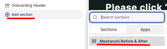
Step 4: Add the Section to the Theme Editor
Now head to the theme editor, Online stores > Themes > Customize
From here, click on the Add section. Search and select the section we created.
Then you can add images for the before and after field from here, and you get minimal options to edit.
Once you’re done making changes, save them. It will look basic and unorganized.
Why Pick the Shopify App?
Creating your store with MIT Pro Sections isn’t just about adding features; it’s about smart, fast design, without getting bogged down in manual coding.
And it goes far beyond a simple before/after slider. With more than 130 free and paid sections, such as banners, testimonials, FAQs, and more.
This app will let you,
- Browse a wide selection of ready-made, beautifully designed sections for any storefront
- Start free with basic templates or unlock premium options for advanced customization
- Add, edit, or replace sections instantly with zero technical skills required
- Keep your page speed optimized while working seamlessly across all Shopify themes
- Customize freely with no hidden restrictions or locked features
- Continuously refresh your store’s design as your business grows
- Install for free, with fair and transparent pricing tailored for all business sizes
- Try it risk-free with a free trial to ensure it fits perfectly with your theme
Above are enough reasons to choose our app and start transforming your store, from every minute detail to the major element, everything is under your control.
Your all-in-one solution to create a professional Shopify store
Install App Now
