Your shop is packed with compelling media, but is it easy to view? A video grid could be just what you need.
Learn how to add a video grid section in Shopify using two different methods to create a binge-worthy gallery, transforming your static page into a dynamic hub for product tutorials and customer testimonials.
Methods to Add a Shopify Video Grid Section
You have two main ways to add a video grid section: a technical way and a non-technical way. Details are below:
- Using custom code – This method involves adding a Liquid section to your theme. It gives you total control over the design and placement, but requires some technical know-how to implement and maintain.
- Using a Shopify app – It allows you to add, customize, and manage video grid sections directly from the Shopify theme editor, no coding needed. These apps are user-friendly, come with styling options, and let you update your video grid instantly.
Get a Ready-to-Use Video Grid Section
Using the MIT Sections Pro Shopify app, you can create a beautiful and fully flexible video grid section. You get access to multiple editable elements like navigation buttons, adjusting video size, autoplay options, and more.
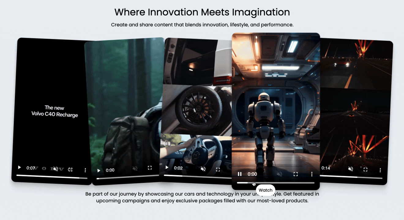
This is an example of what a section can look like:
Here are the steps to configure the video grid using the app.
Step 1: Find and Add Your Desired Section
Install the MIT Sections Pro ( for free) from the Shopify app store, then from the app dashboard, click Browse sections and search for video grid.
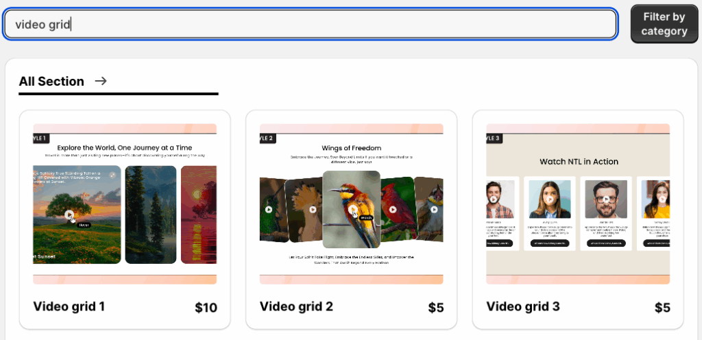
Here we will go ahead with the video grid 2; you can select the one that suits your brand.
Step 2: Click on the “Try for Free” Button
To acquire the section with zero cost, click Try for free.
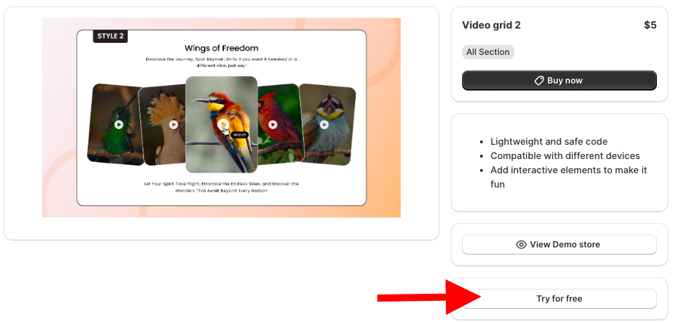
During the free trial, you will be redirected to the MIT demo store. Once you buy the section, you can add it to your Shopify theme and access the code.
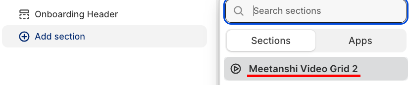
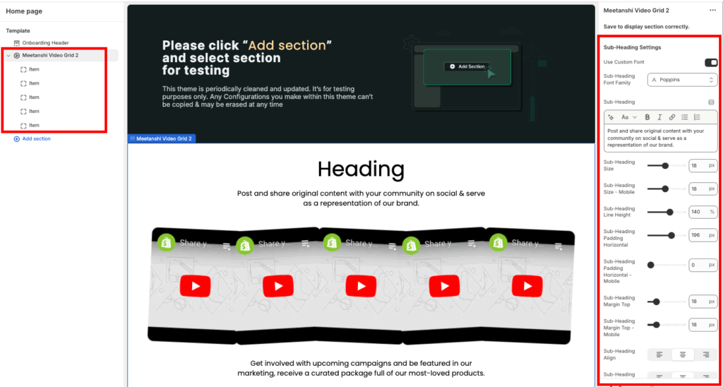
From here, click the Add section and select Meetanshi video grid 2.
Step 3: Edit the Video Grid Section
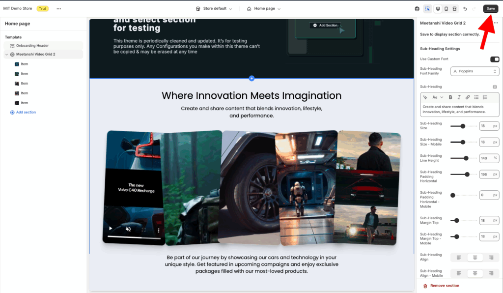
Click Meetanshi video grid 2 to expand the customization. Here, you get 40+ options to blend the section as per your brand’s requirements.
Once done making the changes, save them.
Add a Shopify Video Grid Section (Custom Code)
These are the steps to create a Shopify video grid using Liquid code.
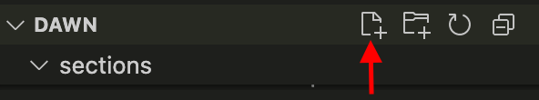
Step 1: Add a New Section
From your Shopify admin panel, head to Online store > Themes > …(three dots) > Edit code.
In the Sections folder, add a new section and name it as video-grid.liquid.
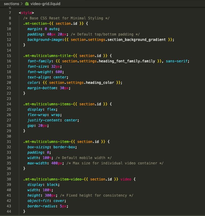
Step 2: Paste the Video Grid Liquid Code
Copy the code from here and paste it into the newly created video-grid.liquid file.
<style>
  /* Base CSS Reset for Minimal Styling */
  .mt-section-{{ section.id }} {
    margin: 0 auto;
    padding: 40px 20px; /* Default top/bottom padding */
    background-image:{{ section.settings.section_background_gradient }};
  }

  .mt-multicolumns-title-{{ section.id }} {
    font-family: {{ section.settings.heading_font_family.family }}, sans-serif;
    font-size: 32px;
    font-weight: 600;
    text-align: center;
    color: {{ section.settings.heading_color }};
    margin-bottom: 30px;
  }

  .mt-multicolumns-items-{{ section.id }} {
    display: flex;
    flex-wrap: wrap;
    justify-content: center;
    gap: 20px;
  }

  .mt-multicolumns-item-{{ section.id }} {
    box-sizing: border-box;
    padding: 0;
    width: 100%; /* Default mobile width */
    max-width: 400px; /* Max size for individual video container */
  }

  .mt-multicolumns-item-video-{{ section.id }} video {
    display: block;
    width: 100%;
    height: 300px; /* Fixed height for consistency */
    object-fit: cover;
    border-radius: 5px;
  }

  @media(min-width: 768px) {
    .mt-multicolumns-items-{{ section.id }} {
      /* Creates 3 columns on desktop */
      justify-content: space-between;
    }
    .mt-multicolumns-item-{{ section.id }} {
      width: calc(33.33% - 14px); /* 3 columns with 20px gap */
    }
    .mt-multicolumns-title-{{ section.id }} {
      font-size: 48px;
    }
  }
</style>

<div class="mt-section-{{ section.id }}">
  <h2 class="mt-multicolumns-title-{{ section.id }}">{{ section.settings.heading_text }}</h2>

  <div class="mt-multicolumns-items-{{ section.id }}">
    {% for block in section.blocks %}
      {% if block.type == 'multicolum_video' %}
        <div class="mt-multicolumns-item-{{ section.id }}">
          <div class="mt-multicolumns-item-video-{{ section.id }}">
            {% if block.settings.video != blank %}
              {{
                block.settings.video
                | video_tag:
                  image_size: '1100x',
                  autoplay: true,
                  loop: true,
                  controls: true,
                  muted: true
              }}
            {% else %}
              <video
                data-src="https://cdn.shopify.com/videos/c/o/v/fbb140fd46e3429eba459e1549dbbe38.mp4"
                playsinline=""
                autoplay=""
                preload="none"
                loop=""
                controls=""
                muted=""
                class="lazy entered loaded"
                src="https://cdn.shopify.com/videos/c/o/v/fbb140fd46e3429eba459e1549dbbe38.mp4"
              ></video>
            {% endif %}
          </div>
        </div>
      {% endif %}
    {% endfor %}
  </div>
</div>

<script>
  // Removed all Swiper JS as slider options were removed.
  // Kept minimal DOMContentLoaded listeners for potential future use.
  if (Shopify.designMode) {
    document.addEventListener('shopify:section:load', function() { console.log('Video Grid Loaded'); });
  }
</script>

{% schema %}
{
  "name": "Video Grid Minimal",
  "tag": "section",
  "settings": [
    {
      "type": "header",
      "content": "Heading"
    },
    {
      "type": "text",
      "id": "heading_text",
      "label": "Heading Text",
      "default": "Video Gallery"
    },
    {
      "type": "font_picker",
      "id": "heading_font_family",
      "label": "Heading Font",
      "default": "poppins_n6"
    },
    {
      "type": "color",
      "id": "heading_color",
      "label": "Heading Color",
      "default": "#121212"
    },
    {
      "type": "color_background",
      "id": "section_background_gradient",
      "label": "Section background"
    }
  ],
  "blocks": [
    {
      "type": "multicolum_video",
      "name": "Video",
      "limit": 6,
      "settings": [
        {
          "type": "video",
          "id": "video",
          "label": "Select Video"
        }
      ]
    }
  ],
  "presets": [
    {
      "name": "Video Grid",
      "settings": {},
      "blocks": [
        { "type": "multicolum_video" },
        { "type": "multicolum_video" },
        { "type": "multicolum_video" }
      ]
    }
  ]
}
{% endschema %}
Step 3: Showcase the Section in the Frontend
Head back to the Shopify store theme editor, Online stores > Themes > Customize.
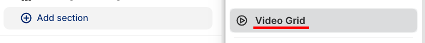
Then, from the left-hand side, click on the Add section and select the video grid.
Click the video grid to expand the customization setting, and here you get very few options, make changes as you wish, and save them.
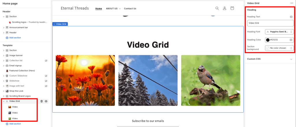
This is how it will look, simple and minimal.

Why Build with MIT Sections Pro?
We give you total control over the section styles, layouts, and designs. Additionally, you get access to over 130 ready-to-use sections that work perfectly with the existing Shopify themes, along with a free trial to check it out.
This must-have app allows you to quickly update YouTube links and adjust section styles, with built-in mobile settings for a responsive experience on any device.
Making everything manageable in a single dashboard.
Your all-in-one solution to create a professional Shopify store
Install App Now
