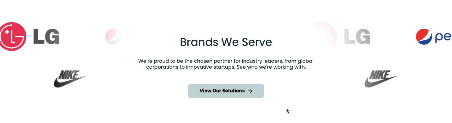
Instead of stacking logos in one place, make them flow across your Shopify store with a scrolling effect. This not only adds movement and life to your site but also showcases your brand partners in a professional, eye-catching way.
Here’s how to add a scrolling logos section in Shopify using various methods and give your site a professional edge.
Ways to Add a Shopify Scrolling Logos Section
There are apparently two options for you to add this feature to your site, which are as follows.
- Via custom code – Insert a section into your theme files to create a scrolling logo carousel. This approach allows for high customization and integration, but it requires high coding knowledge, manual setup, and plenty of time.
- Using a Shopify app – If you prefer a visual, easy-to-use interface or need more styling features (like interactive hover effects or dynamic grids) without touching code, a dedicated Shopify app is the best route.
Add a Pre-made Scrolling Logos Section
Use the MIT Sections Pro app to get a beautiful, ready-to-add section. Our app gives high flexibility, different styles of sections, advanced customization, such as infinite animation, scrolling direction, navigation button, and more.
This is an example of the section; you can create something similar to this using our app.

Let us see how the app works.
Step 1: Install and Find Your Desired Section
Install the MIT Sections Pro (free) from the Shopify App Store, then from the app dashboard, click Browse sections and search for the Scrolling logo.
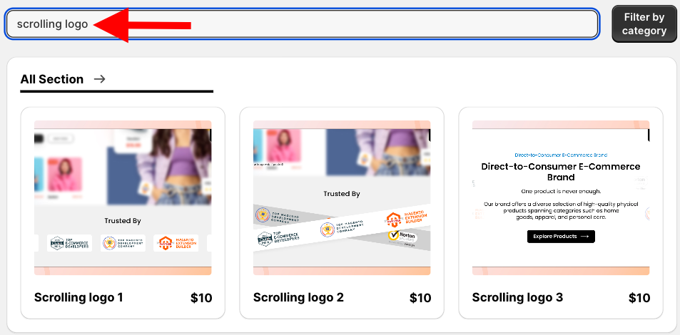
We will proceed with Scrolling logo 3, though you can choose the option that best suits your brand.
Step 2: Click on the “Try for Free” Button
Select the section and click Try for Free to acquire the free trial of the section.
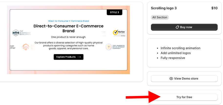
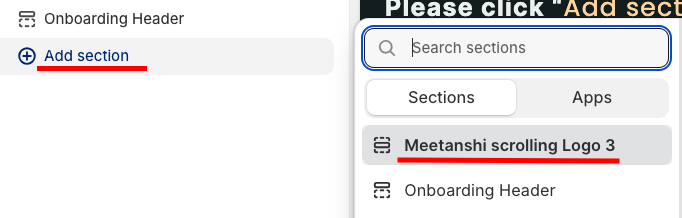
While on the free trial, you will be redirected to the MIT demo store, and after you purchase the section, you can have it in your store’s theme.
From here, click Add section and select Meetanshi scrolling Logo 3
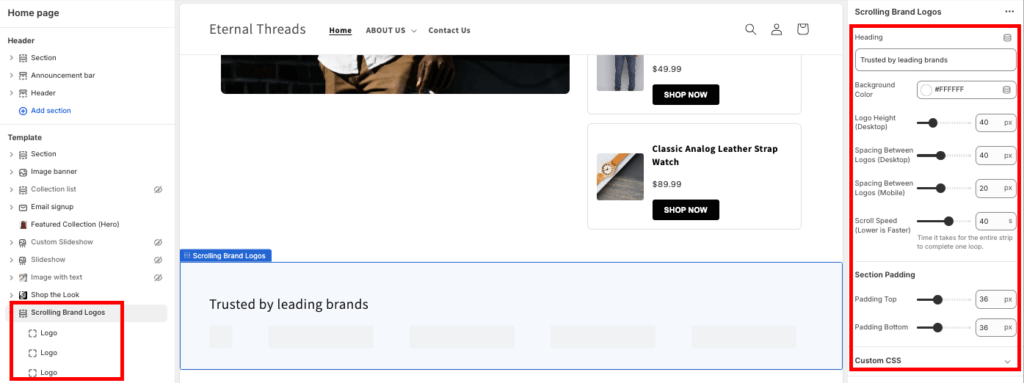
Step 3: Modify the Section
Click Meetanshi scrolling Logo 3 to access the customization settings. Here, you get 70+ options to blend the section as per your needs.
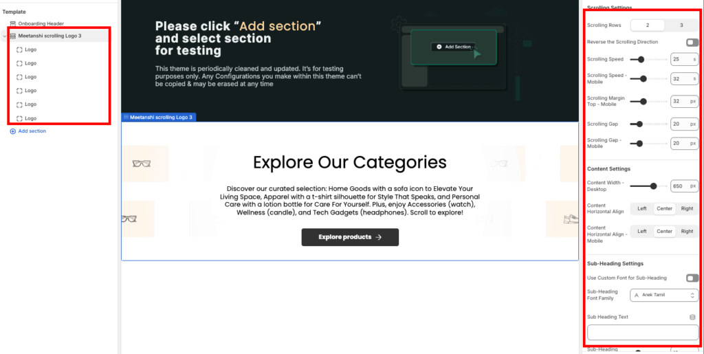
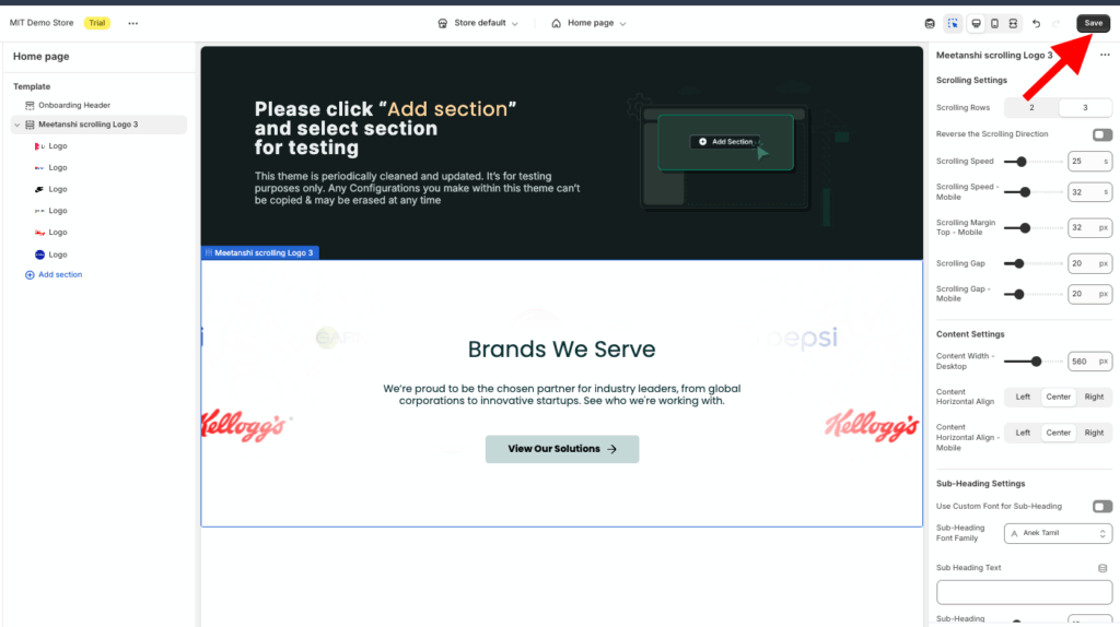
Once done making the changes, save them.
Create a Scrolling Logos Section in Shopify Using Custom Code
These are the steps to design the scrolling logos section using Liquid code.
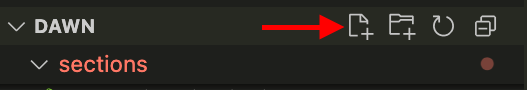
Step 1: Add a New Section
From your Shopify admin panel, head to Online store > Themes > …(three dots) > Edit code. In the Sections folder, create a new section and save it as scrolling-logos.liquid.
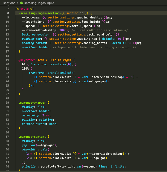
Step 2: Paste the Scrolling Logos Code
Then copy the code below and paste it into the newly created scrolling-logos.liquid section, and save the file. It will create a simple section with minimal functionalities.
{% style %}
  .scrolling-logos-section-{{ section.id }} {
    --logo-gap: {{ section.settings.spacing_desktop }}px;
    --logo-height: {{ section.settings.logo_height }}px;
    --speed: {{ section.settings.scroll_speed }}s;
    --item-width-desktop: 200px; /* Fixed width for calculation */
    background-color: {{ section.settings.background_color }};
    padding-top: {{ section.settings.padding_top | default: 36 }}px;
    padding-bottom: {{ section.settings.padding_bottom | default: 36 }}px;
    overflow: hidden; /* Important to hide overflow during animation */
  }
  @keyframes scroll-left-to-right {
    0% { transform: translateX(0); }
    100% {
        transform: translateX(calc(
          ({{ section.blocks.size }} * var(--item-width-desktop) * -1) -
          ({{ section.blocks.size }} * var(--logo-gap))
        ));
    }
  }
  .marquee-wrapper {
    display: flex;
    overflow: hidden;
    margin-top: 2rem;
    position: relative;
    /* Ensure only blocks are clickable, not the container */
    pointer-events: none;
  }

  .marquee-content {
    display: flex;
    gap: var(--logo-gap);
    min-width: calc(
      (2 * {{ section.blocks.size }} * var(--item-width-desktop)) +
      (2 * {{ section.blocks.size }} * var(--logo-gap))
    );
    animation: scroll-left-to-right var(--speed) linear infinite;
  }
  .marquee-wrapper:hover .marquee-content {
    animation-play-state: paused;
  }
  .logo-item {
    display: flex;
    align-items: center;
    justify-content: center;
    height: var(--logo-height);
    width: var(--item-width-desktop); /* Enforce the fixed width for consistent scroll calculation */
    padding: 0 10px; /* Internal padding for logos */
    flex-shrink: 0;
    opacity: 0.7; /* Subtly fade the logos */
    transition: opacity 0.3s;
    box-sizing: border-box; /* Include padding in the width calculation */
  }

  .logo-item:hover {
    opacity: 1;
  }

  /* Image styling */
  .logo-item img {
    height: 100%;
    width: auto;
    max-width: 100%;
    object-fit: contain;
  }
  @media screen and (max-width: 768px) {
    .scrolling-logos-section-{{ section.id }} {
      --logo-gap: {{ section.settings.spacing_mobile | default: 16 }}px;
      --logo-height: {{ section.settings.logo_height | divided_by: 1.5 }}px; /* Make logos smaller on mobile */
      --item-width-desktop: 150px; /* Use smaller width for mobile calculation */
    }

    @keyframes scroll-left-to-right {
        0% { transform: translateX(0); }
        100% {
            transform: translateX(calc(
              ({{ section.blocks.size }} * 150px * -1) -
              ({{ section.blocks.size }} * var(--logo-gap))
            ));
        }
    }
  }

{% endstyle %}

<section class="scrolling-logos-section-{{ section.id }}">
  <div class="page-width">
    {%- if section.settings.title != blank -%}
      <h2 class="h2 text-center" style="margin-bottom: {{ section.settings.padding_top | divided_by: 2 }}px;">
        {{ section.settings.title | escape }}
      </h2>
    {%- endif -%}

    <div class="marquee-wrapper" id="Marquee-{{ section.id }}">
      <div class="marquee-content" role="list">
        {%- for block in section.blocks -%}
          {%- liquid
            assign image_url = block.settings.logo | image_url: width: 300
            assign image_alt = block.settings.logo.alt | default: block.settings.logo.original_filename
            assign image_tag = block.settings.logo | image_url: width: 300 | image_tag: loading: 'lazy', sizes: '(max-width: 768px) 150px, 200px', widths: '100, 150, 200, 300', alt: image_alt
            assign link = block.settings.link
          -%}

          <div class="logo-item">
            {%- if link != blank -%}
              <a href="{{ link }}" title="{{ 'sections.scrolling_logos.link_title' | t: title: image_alt }}" style="pointer-events: auto;">
                {%- if block.settings.logo != blank -%}
                  {{ image_tag }}
                {%- else -%}
                  <div class="placeholder-logo" style="height: var(--logo-height); width: 100%; background: #eee; border-radius: 4px;">
                    <!-- Placeholder for missing image -->
                  </div>
                {%- endif -%}
              </a>
            {%- else -%}
              {%- if block.settings.logo != blank -%}
                {{ image_tag }}
              {%- else -%}
                <div class="placeholder-logo" style="height: var(--logo-height); width: 100%; background: #eee; border-radius: 4px;">
                  <!-- Placeholder for missing image -->
                </div>
              {%- endif -%}
            {%- endif -%}
          </div>
        {%- endfor -%}

        {% comment %}
          Duplicate the logos to create the seamless loop effect using CSS animation.
          This second loop must exactly mirror the first.
        {% endcomment %}
        {%- for block in section.blocks -%}
          {%- liquid
            assign image_url = block.settings.logo | image_url: width: 300
            assign image_alt = block.settings.logo.alt | default: block.settings.logo.original_filename
            assign image_tag = block.settings.logo | image_url: width: 300 | image_tag: loading: 'lazy', sizes: '(max-width: 768px) 150px, 200px', widths: '100, 150, 200, 300', alt: image_alt
            assign link = block.settings.link
          -%}

          <div class="logo-item" aria-hidden="true">
            {%- if link != blank -%}
              <a href="{{ link }}" title="{{ 'sections.scrolling_logos.link_title' | t: title: image_alt }}" style="pointer-events: auto;">
                {%- if block.settings.logo != blank -%}
                  {{ image_tag }}
                {%- else -%}
                  <div class="placeholder-logo" style="height: var(--logo-height); width: 100%; background: #eee; border-radius: 4px;">
                    <!-- Placeholder for missing image -->
                  </div>
                {%- endif -%}
              </a>
            {%- else -%}
              {%- if block.settings.logo != blank -%}
                {{ image_tag }}
              {%- else -%}
                <div class="placeholder-logo" style="height: var(--logo-height); width: 100%; background: #eee; border-radius: 4px;">
                  <!-- Placeholder for missing image -->
                </div>
              {%- endif -%}
            {%- endif -%}
          </div>
        {%- endfor -%}
      </div>
    </div>
  </div>
</section>

{% schema %}
{
  "name": "Trust: Scrolling Logos",
  "tag": "section",
  "settings": [
    {
      "type": "text",
      "id": "title",
      "label": "Heading",
      "default": "Trusted by leading brands"
    },
    {
      "type": "color",
      "id": "background_color",
      "label": "Background Color",
      "default": "#ffffff"
    },
    {
      "type": "range",
      "id": "logo_height",
      "min": 20,
      "max": 100,
      "step": 5,
      "unit": "px",
      "label": "Logo Height (Desktop)",
      "default": 40
    },
    {
      "type": "range",
      "id": "spacing_desktop",
      "min": 10,
      "max": 80,
      "step": 5,
      "unit": "px",
      "label": "Spacing Between Logos (Desktop)",
      "default": 40
    },
    {
      "type": "range",
      "id": "spacing_mobile",
      "min": 5,
      "max": 40,
      "step": 5,
      "unit": "px",
      "label": "Spacing Between Logos (Mobile)",
      "default": 20
    },
    {
      "type": "range",
      "id": "scroll_speed",
      "min": 10,
      "max": 60,
      "step": 5,
      "unit": "s",
      "label": "Scroll Speed (Lower is Faster)",
      "default": 40,
      "info": "Time it takes for the entire strip to complete one loop."
    },
    {
      "type": "header",
      "content": "Section Padding"
    },
    {
      "type": "range",
      "id": "padding_top",
      "min": 0,
      "max": 100,
      "step": 4,
      "unit": "px",
      "label": "Padding Top",
      "default": 36
    },
    {
      "type": "range",
      "id": "padding_bottom",
      "min": 0,
      "max": 100,
      "step": 4,
      "unit": "px",
      "label": "Padding Bottom",
      "default": 36
    }
  ],
  "blocks": [
    {
      "type": "logo_item",
      "name": "Logo",
      "settings": [
        {
          "type": "image_picker",
          "id": "logo",
          "label": "Brand Logo (SVG or PNG recommended)",
          "info": "Logos should be simple and high-quality."
        },
        {
          "type": "url",
          "id": "link",
          "label": "Logo Link (Optional)"
        }
      ]
    }
  ],
  "presets": [
    {
      "name": "Scrolling Brand Logos",
      "blocks": [
        {
          "type": "logo_item"
        },
        {
          "type": "logo_item"
        },
        {
          "type": "logo_item"
        },
        {
          "type": "logo_item"
        }
      ]
    }
  ]
}
{% endschema %}
Step 3: Show the Section in the Frontend
Now head back to the Shopify admin panel, Online store > Themes > Customize.
Then, from the theme editor left sidebar, click Add section and search for Scrolling Brand logos, select it.

Click Scrolling Brand Logos to expand the customization settings. Then, from here, you can add logos and make other basic changes.
Make sure to also optimize and fix blurry logos on Shopify so they appear crisp and polished.
Once done customizing the section, save it. See the preview in the frontend. This is how it looks, simple and minimal.

Why Choose the App Method?
For Shopify owners, the MIT Sections Pro app is a superior choice for a scrolling logo section due to its simplicity and robust features, including various scrolling animations like cross-logo and horizontal, which would otherwise require expert coding skills.
- Explore a broad range of expertly designed sections that cater to any need your storefront may have
- Begin with free templates or unlock advanced options by choosing from premium sections
- Effortlessly add, customize, or swap out sections at any time, all without the need for technical expertise
- Universal compatibility with all Shopify themes, fast loading speeds, and seamless design integration
- Take advantage of limitless customization with no hidden restrictions, allowing for true brand alignment
- Adapt your store easily as it grows by adding or exchanging sections for a fresh, up-to-date look
- Install for free and benefit from transparent, affordable pricing that fits any business
- Use the free trial to make sure the features and compatibility are just right before deciding
Your all-in-one solution to create a professional Shopify store
Install App Now
