Images can make or break your store’s first impression. While Shopify does include built-in options to add images, these features can be limited in terms of design and responsiveness.
A responsive image section ensures visuals automatically adjust to every screen size, maintaining perfect alignment, quality, and speed.
You can create one using an app for a quick, no-code setup or custom code for full design flexibility (though it requires some technical skill).
Let’s walk through how to add a responsive image section in Shopify quickly and easily.
Method 1: Add Shopify Responsive Image Section (Using App)
Using the MIT Sections Pro, you can add an image section that automatically adjusts to any screen size, keeping visuals sharp, well-aligned, and fast-loaded with proper Shopify image optimization.
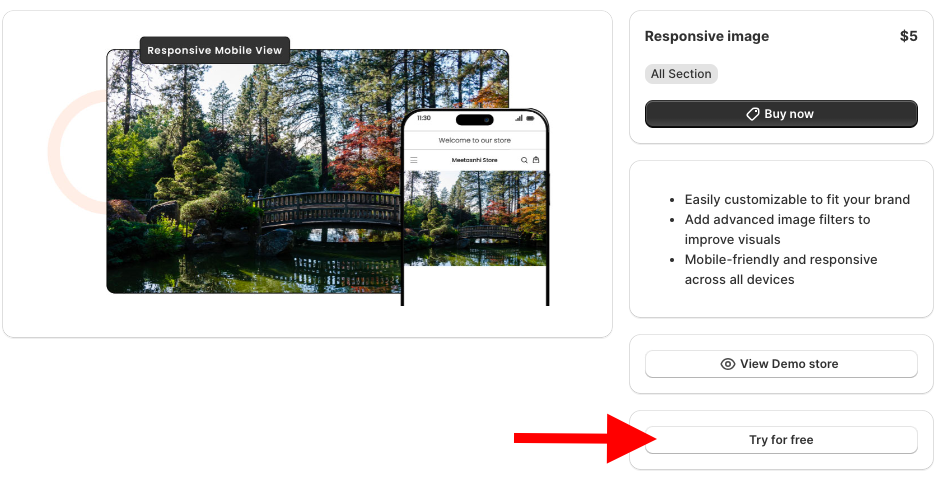
Here’s an example of what a responsive image should look like.

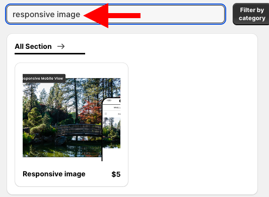
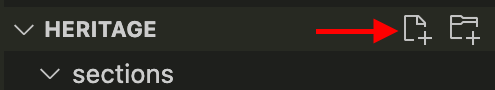
Step 1: Find the Section in Shopify
Install the MIT Sections Pro from the Shopify App Store, then from the app dashboard, click Browse sections and search for responsive image.
Step 2: Open the Shopify Theme Editor
To acquire this section without any cost, click Try for free.
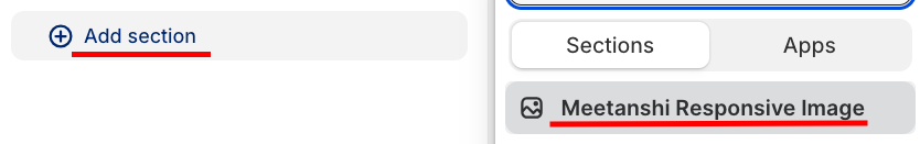
During the free trial, you will be redirected to the MIT demo store. Once you purchase it, you can have it in your store. From the left sidebar, click Add section and select Meetanshi Responsive image.
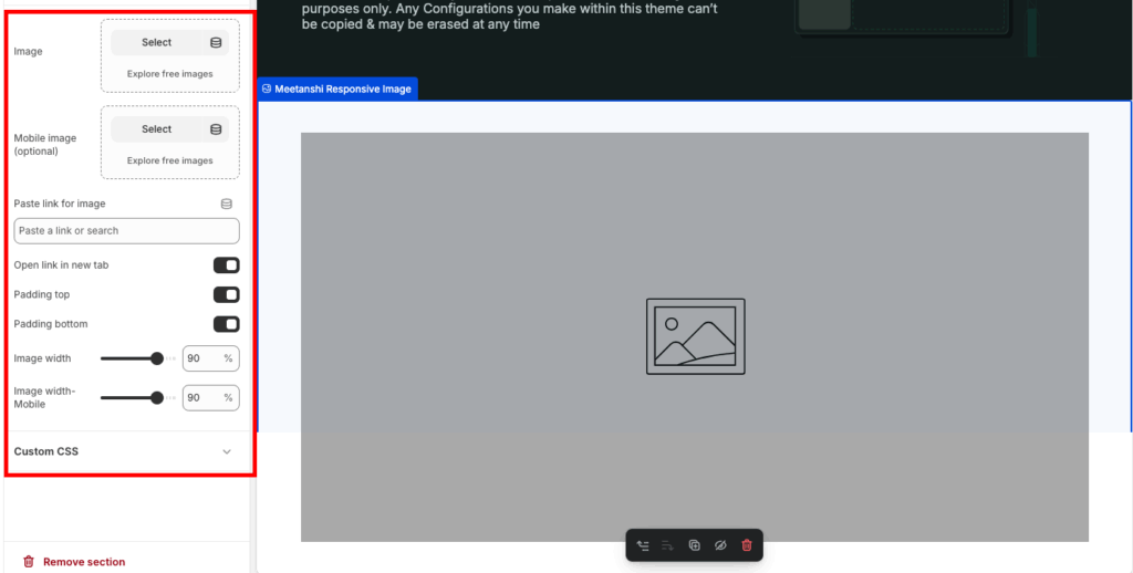
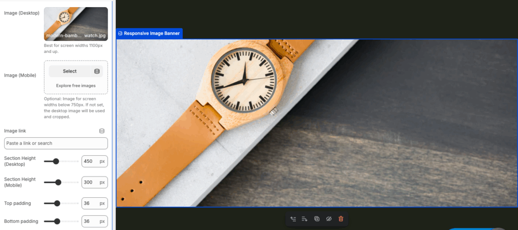
Step 3: Customize the Section
Click Meetanshi Responsive image to expand the customization settings. Make the needed changes and save them.
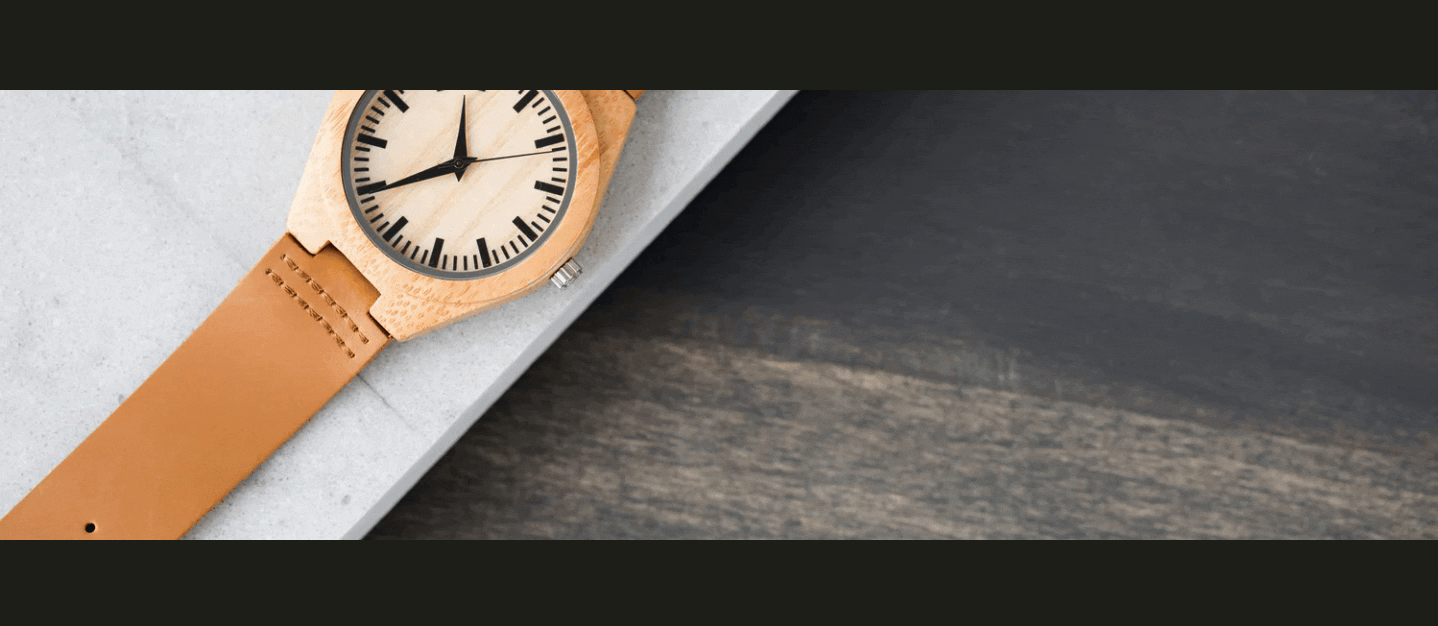
This is how it will look in the frontend based on the customization you have made.

Method 2: Custom Code to Responsive Image Section
Here are the clear steps if you want to opt for the technical way.
Step 1: Create New Section
From your Shopify admin panel, Online stores > Themes > …(Three dots) > Edit code. Then, from the sections folder, add a new section and save it as responsive-image.liquid.
Step 2: Add Code to Section
Then paste the code below in the newly created responsive-image.liquid section and save it.
{%- liquid
  assign image = section.settings.image
  assign mobile_image = section.settings.mobile_image
  assign link = section.settings.link
  assign height_desktop = section.settings.height_desktop
  assign height_mobile = section.settings.height_mobile
-%}

<div class="responsive-image-banner section-{{ section.id }}">
  <div class="responsive-image-banner__wrapper">

    {% if link != blank %}<a href="{{ link }}">{% endif %}

      {% if image != blank %}
        <div class="image-wrapper desktop-only">
          {{ image | image_url: width: 2000 | image_tag: widths: '375, 550, 750, 1100, 1500, 1780, 2000', sizes: '100vw', loading: 'lazy' }}
        </div>
      {% endif %}

      {% if mobile_image != blank %}
        <div class="image-wrapper mobile-only">
          {{ mobile_image | image_url: width: 1000 | image_tag: widths: '375, 550, 750', sizes: '100vw', loading: 'lazy' }}
        </div>
      {% endif %}

    {% if link != blank %}</a>{% endif %}

  </div>
</div>

{% style %}
  /* Section Styling */
  .section-{{ section.id }} {
    margin-top: {{ section.settings.padding_top }}px;
    margin-bottom: {{ section.settings.padding_bottom }}px;
  }

  /* Desktop Image Height and General Styling */
  .section-{{ section.id }} .image-wrapper {
    overflow: hidden;
    height: {{ height_desktop }}px; /* Desktop height from settings */
  }

  .section-{{ section.id }} .image-wrapper img {
    width: 100%;
    height: 100%;
    object-fit: cover; /* Ensures the image covers the container without distortion */
  }

  /* Mobile-Specific Styles */
  @media screen and (max-width: 749px) {
    .section-{{ section.id }} .image-wrapper.desktop-only {
      display: none; /* Hide desktop image on mobile */
    }

    .section-{{ section.id }} .image-wrapper.mobile-only {
      display: block; /* Show mobile image on mobile */
      height: {{ height_mobile }}px; /* Mobile height from settings */
    }
  }

  /* Hide Mobile Image on Desktop */
  @media screen and (min-width: 750px) {
    .section-{{ section.id }} .image-wrapper.mobile-only {
      display: none;
    }
  }

  /* Ensure desktop image is visible on desktop */
  @media screen and (min-width: 750px) {
    .section-{{ section.id }} .image-wrapper.desktop-only {
      display: block;
    }
  }
{% endstyle %}

{% schema %}
{
  "name": "Responsive Image Banner",
  "tag": "section",
  "class": "section-responsive-image",
  "settings": [
    {
      "type": "image_picker",
      "id": "image",
      "label": "Image (Desktop)",
      "info": "Best for screen widths 1100px and up."
    },
    {
      "type": "image_picker",
      "id": "mobile_image",
      "label": "Image (Mobile)",
      "info": "Optional: Image for screen widths below 750px. If not set, the desktop image will be used and cropped."
    },
    {
      "type": "url",
      "id": "link",
      "label": "Image link"
    },
    {
      "type": "range",
      "id": "height_desktop",
      "min": 200,
      "max": 1000,
      "step": 50,
      "unit": "px",
      "label": "Section Height (Desktop)",
      "default": 450
    },
    {
      "type": "range",
      "id": "height_mobile",
      "min": 100,
      "max": 600,
      "step": 50,
      "unit": "px",
      "label": "Section Height (Mobile)",
      "default": 300
    },
    {
      "type": "range",
      "id": "padding_top",
      "min": 0,
      "max": 100,
      "step": 4,
      "unit": "px",
      "label": "Top padding",
      "default": 36
    },
    {
      "type": "range",
      "id": "padding_bottom",
      "min": 0,
      "max": 100,
      "step": 4,
      "unit": "px",
      "label": "Bottom padding",
      "default": 36
    }
  ],
  "presets": [
    {
      "name": "Responsive Image Banner"
    }
  ]
}
{% endschema %}
Step 3: Edit the Theme Editor
Head back to the Shopify admin panel, Online stores > Themes > Customize. From the theme editor sidebar, click Add section and select Responsive Image Banner.

Click the Responsive Image Banner to expand the modification features.
Once done making changes, save them. This is how it will work.
Why Pick the Shopify App to Add a Responsive Image?
Our app ensures that your site’s images display smoothly on all devices without compromising quality. It also offers a variety of features, such as:
- Instantly access 130+ pre-made free and paid sections, including featured collections, newsletters, banners, testimonials, FAQs, and more
- Add any section to your store with zero coding or technical skills required
- Free installation with advanced customization available, even for free templates
- Fully optimized for speed and seamless compatibility with all Shopify themes
- Simple editing allows you to personalize each section as your business grows
- Offers flexibility to add, edit, or swap out sections anytime
- Provides cost-effective options for businesses of all sizes, with a free trial included
Your all-in-one solution to create a professional Shopify store
Install App Now
